
April 8, 2022
Kyle Fawcett
The world is flooded with millions of different pitch decks which means that if you’re pitching investors they have probably seen dozens in the same week. I don’t say this to intimidate you but rather to emphasize the importance of making sure your presentation is clean, concise, informative, and interesting. One way to deliver compelling information in a compact manner is to visualize your data. Helpful and interesting charts, graphs, and tables that help explain your point. Perhaps you’re interested in what types of charts, graphs, and tables to use in your pitch deck? We analyzed pitch decks of 50 of the most successful companies in recent years to find what types of data visualizations were used the most, which means you probably should too.
So we both agree that data visualization is important in your pitch deck or else you wouldn’t be reading this. Heck, you may even already know what data you want to use to make some charts and graphs so you can polish off your pitch deck. In this article we’re going to outline 5 different tools you can use to create really nice charts and graphs that will certainly elevate your pitch deck to where it should be.
Getting your Data Ready for Visualization
Before we dive in to showing how you can make some nice charts and graphs using a variety of different tools, it’s important to mention that you will need some data. Perhaps that sounds obvious but it’s worth mentioning. We also recommend having a variety of data that you can use to make some different chart options.
If you have existing customers, you might use a tool like Segment to organize your data. If you are still in the planning stages of your business, another really vital and compelling chunk of data to be visualized is your projected financials. If you have yet to create financial projections for your pitch deck, we recommend checking out ProjetionHub’s 70+ CPA developed financial projection templates all made for different specific industries which can help you get your numbers ready for visualization in no time.
Using Datawrapper to Make Charts for your Pitch Deck
First up Datawrapper is a powerful free to use tool that enables you to create some really nice looking graphs, tables, and maps and even provides a pretty good selection of customization options. Plus they are embeddable which is huge. They do have a premium plan option but it’s a pretty steep price and frankly isn’t necessary. You should be able to get by just fine with the free plan. I’ll walk through a pretty simple example of making a chart so you can see it in action.
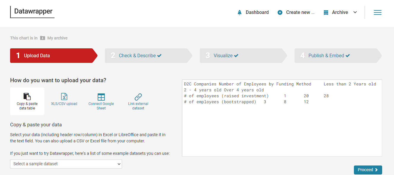
You can see below the data input is pretty straightforward giving you the option to copy and paste in your data, upload an excel sheet, connect to google sheets or link to a json file. I opted for the paste in version because I found it much easier to do. Also just warning this process can be a little finicky and if you use an symbols like $ it will interrupt how the chart is displayed. You have the ability to add in custom symbols on a later screen so leave them out on the input.
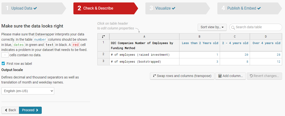
Next, you’ll double check that Datawrapper organized your data as you expected it to and that the system assigned the correct properties. For instance black colored values means it’s text and blue means it’s a number. One important note worth mentioning here is that “swap rows and columns” button down at the bottom is helpful to come back to if your chart feels a little backwards. That will allow you to swap the columns and rows so you can flip your axis on the chart.
When you move on to the “visualize” section this is where you can choose which type of chart you want. Based upon the way you input your data there will be certain chart types that won’t work for you but there is a good selection. You can also see some sub menus on the left side that say “Refine”, “Annotate”, and “Layout” which is where you will be able to do all of the customization of colors, legend, labels, fonts, etc. to polish the chart up.

Lastly the “publish” step is exactly what it sounds like where you’ll get the option to publish the chart which you have to do in order to be able to use outside of Datawrapper. You will have the ability to export the chart as a PNG but what makes Datawrapper really powerful is that you can embed the chart on your own website and the charts will actually still be interactive. You can see a real example of we used Datawrapper in our 2022 Startup Stats Report here. The tool has it’s limitations and takes some practice but if you have your numbers in hand and have some technical savvy, you’ll have some really nice charts in no time.
Using ProjectionHub’s Charts & Graphs Generator Tool
We know what you’re thinking... “Oh here we go ProjectionHub trying to sell me something” and you’d be right to think that! However, we wouldn’t include this tool on the list if we hadn’t received such positive feedback on how helpful this has been for many of our customers. I mentioned earlier that one of the most important pieces of information not only for a business plan, pitch deck, or loan application is to have financial projections ready to go. If you have projections already in hand, ProjectionHub’s Charts & Graphs tool gives you the ability to automatically generate nearly 100 different charts and graphs based upon your specific projections. And if you use one of ProjectionHub’s 57 different industry projection templates, this tool is formatted to handle simple copy and paste of data and boom you’ve got 100 charts ready to go.
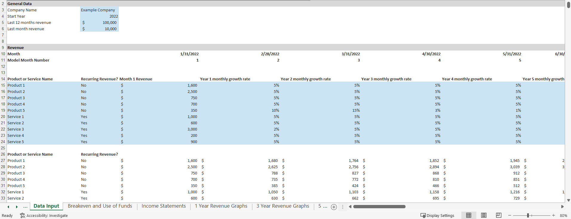
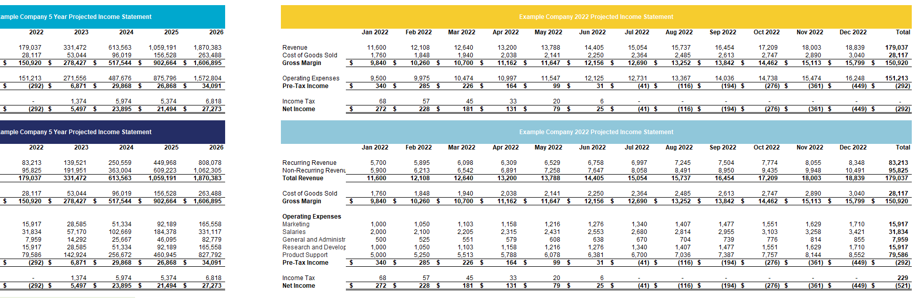
Here you can see a section of the data input section of the ProjectionHub Charts & Graphs tool where you will plug in your projection data. The tool has sections for you to enter in your projected unique product and service revenue numbers, cost of goods sold, operating expenses, startup costs, investments, and KPI’s.
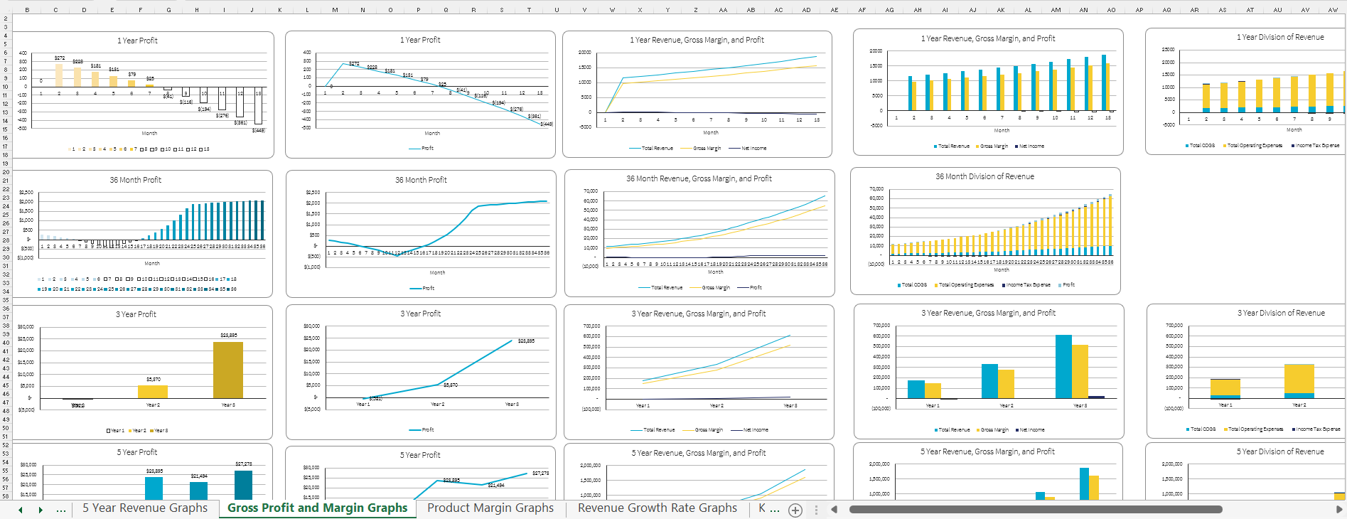
Next, you can see an example of two of the output tabs where all of the charts and financial tables are automatically updated using your custom inputs. Every chart can be customized in it’s appearance and you can even change all of them at once by editing the excel theme (which are also downloadable for free from other marketplaces) and you can export every individual chart as an image for use.
Using Infogram to Make Charts & Graphs
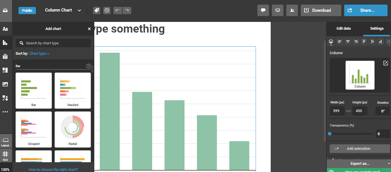
Another great tool to visualize data is Infogram. Infogram’s original purpose was to help people create elaborate and helpful infographics which it does really well. Well what it also does well is when people just want to make one chart or graph at a time instead of a large collage of information and charts. Infogram does offer a free forever subscription level but the options are pretty limited at this level. You can still definitely make some nice charts but to really get the full functionality of infogram I’d recommend the pro or business level. Here you can see how the layout of the tool looks, how there are many different chart options on the left hand side, the canvas in the middle, and then the panels on the right side where you can make some customizations.
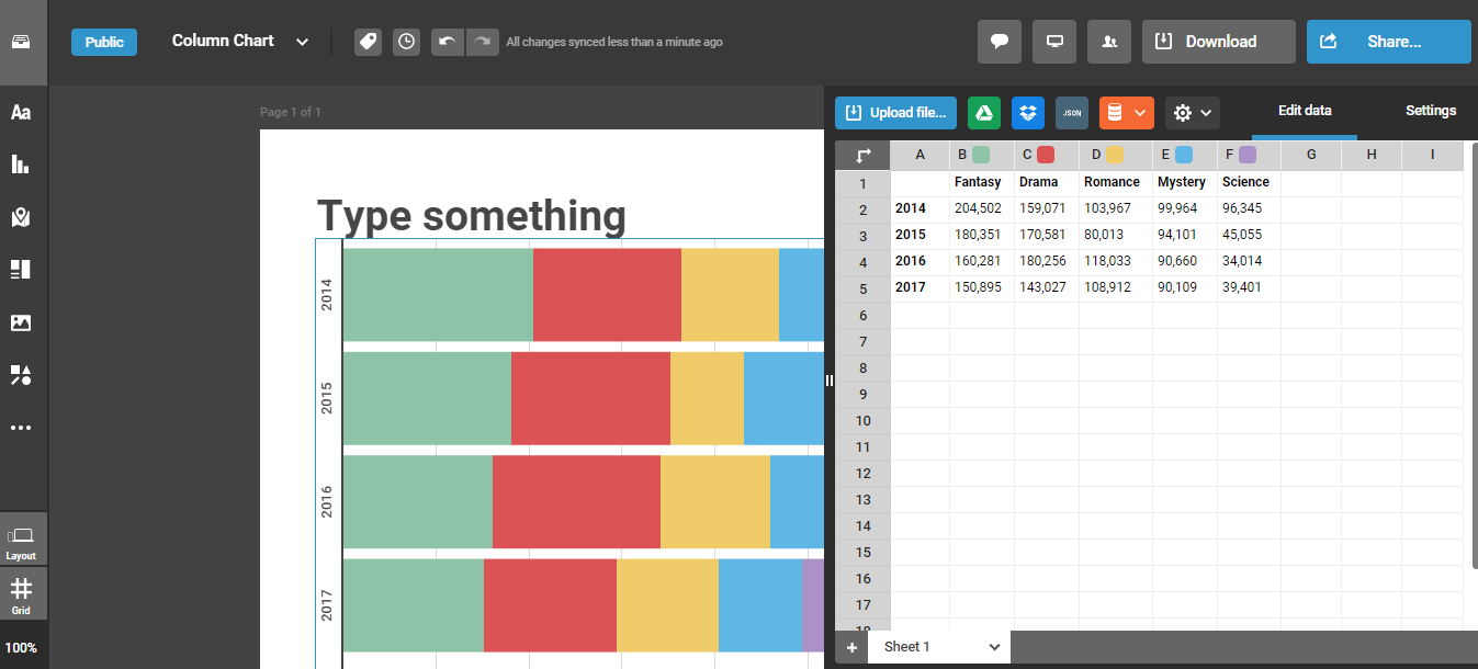
Here you can see an inside look on where you actually input and organize the data that the charts will use. It’s nice that it comes with some dummy data put in so it is easy to see what you can replicate with your data to ensure the chart looks like it should. Some other really nice features of Infogram, especially at the premium subscription levels, is you can have charts with multiple tabs to quickly swap between views, charts are embeddable and retain their interactivity like with Datawrapper, there are many chart templates to choose from and design themes, and I would say this tool is a much more comprehensive design tool rather than just a chart builder. For those with some aptitude for design, infogram allows for the creation of some pretty neat things.
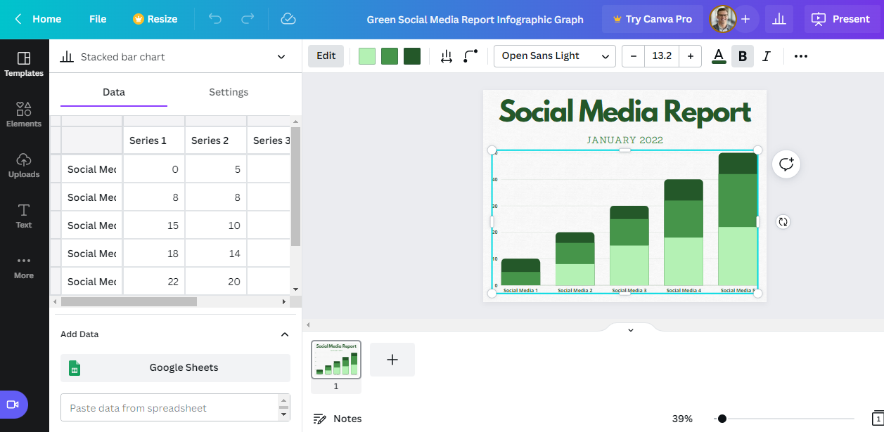
Using Canva to Create Charts & Graphs for a Pitch Deck
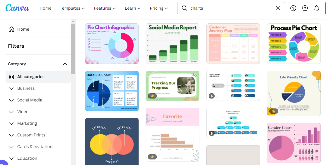
Similar to Infogram, Canva is more of a full service design platform enabling users to create things from business cards to logos to charts and graphs. Canva is a very popular design tool in that it allows users to start designing for free. Here you can see just a section of the long list of templates you can start with and customize your charts and graphs.
Next you can see inside how you can edit the data within the chart template on canva as well as some customization options across the top.
Using Excel or Google Sheets to Make Charts and Graphs
Last on our list but still certainly worth mentioning is to use a worksheet editor like Excel or Google sheets. Both Excel and Google Sheet have solid chart, graph, and table building abilities but where they seem to lack a little is in the design customization however the options will suffice for most. Plus, you can always flesh out your data visualization plans in excel and then hand them over to a designer or pitch deck consultant to help make it shine. Particularly if your projections are in excel or google sheets, it may be easiest to just start building charts and graphs using the data right at your fingertips! A big bonus of excel is that there are thousands of video tutorials and guides on how to make exactly what you need.
Now that you are equipped with 5 tools to turn your pitch data into compelling visuals, perhaps you are curious what charts you should use on which slides in your pitch deck? If you have any questions or need pointed in the direction of some great resources to get your pitch deck ready to go for investors, drop us a line at support@projectionhub.com.
Photo by PhotoMIX Company
